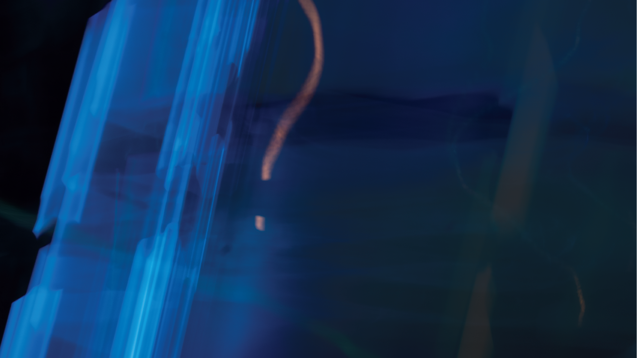






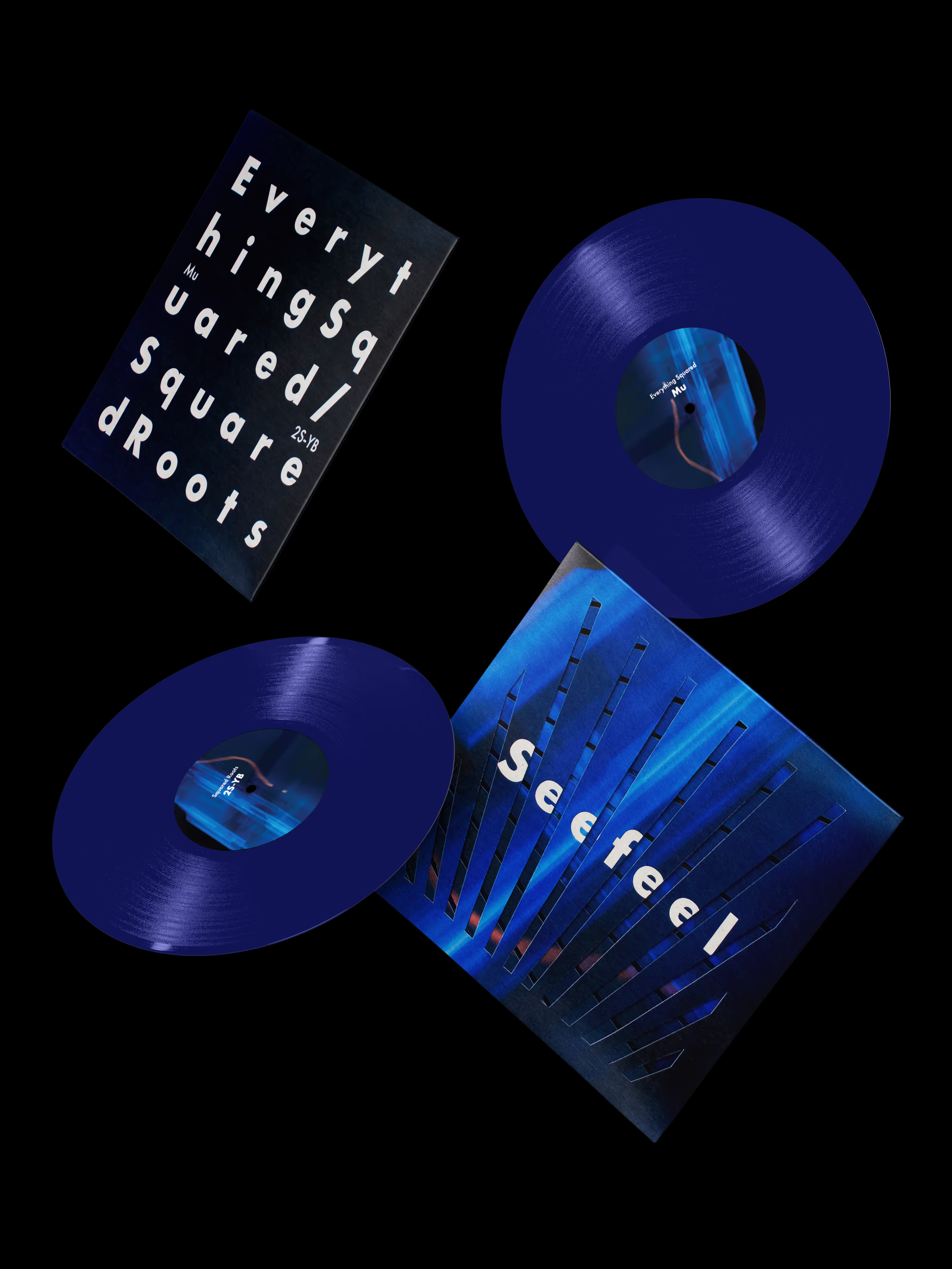
The brief was to create a promotional design system featuring Seefeel’s live show at the Club Soda venue in Montréal. The work included a large-format poster, digital adaptations for social media, and a limited-edition 7-inch vinyl sleeve with special packaging. The challenge was to translate the band’s layered, atmospheric sound into an intriguing visual language that could move seamlessly between print, screen, and object, avoiding predictable music imagery while maintaining strong typographic hierarchy and legibility.

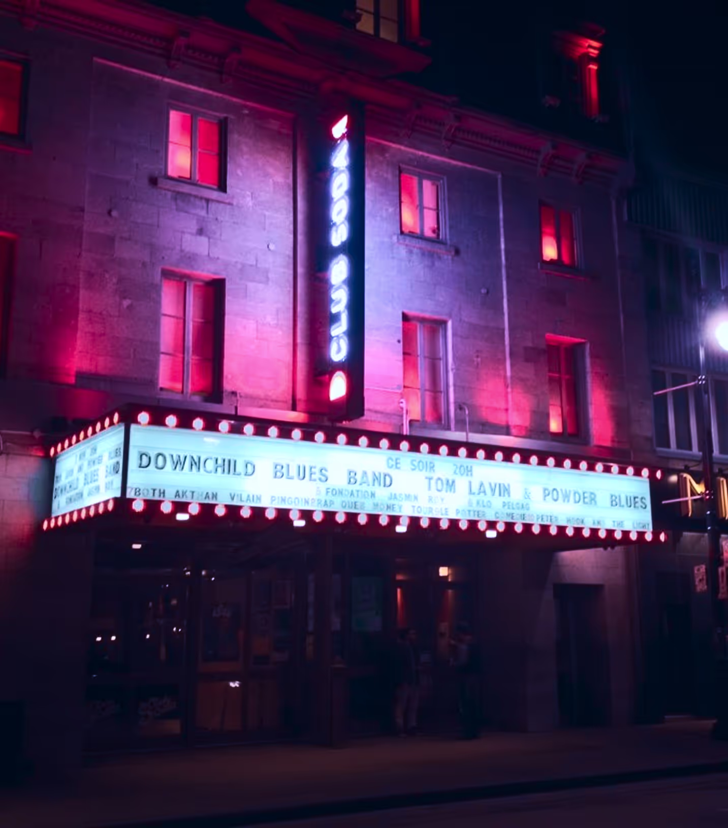
My concept translates the atmospheric and experimental nature of Seefeel into a visual language that reflects how their music behaves, structured yet fluid, minimal yet immersive. Inspired by the band’s loop-based compositions and ethereal textures, the concept explores the tension between geometry and atmosphere, where rigid typographic structures interact with soft, diffused light and motion. Rather than illustrating the music literally, the goal was to create a visual experience that feels layered, introspective, and slightly enigmatic, much like the sonic world of the featured albums Everything Squared and Square Roots.
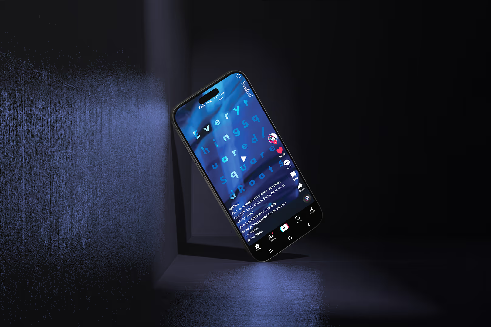
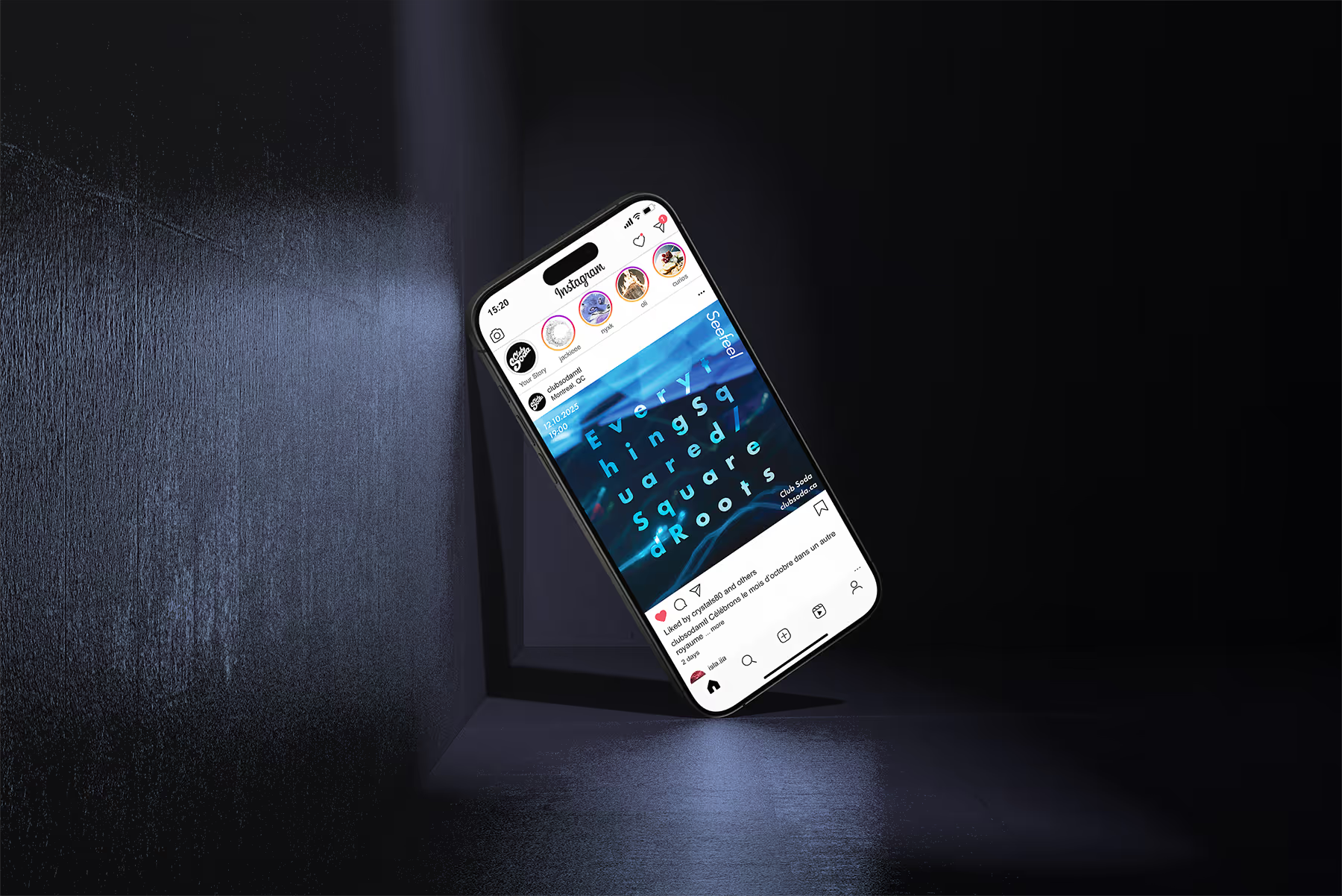
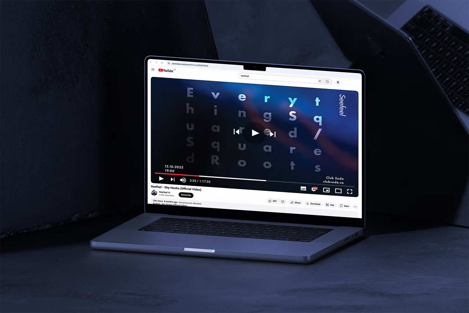


The identity centers on the idea of revealing light, combining fragmented grid structures with spacious typography and abstract imagery to create depth and rhythm while preserving clarity. Cool blue tones and deep shadows evoke the band’s nocturnal, ambient sound, while minimal compositions allow the visuals to breathe. A die-cut vinyl sleeve extends this language into a tactile experience, revealing layered artwork beneath. Across print, digital, and object, the system unfolds gradually, mirroring Seefeel’s music and building anticipation before the first track even begins.


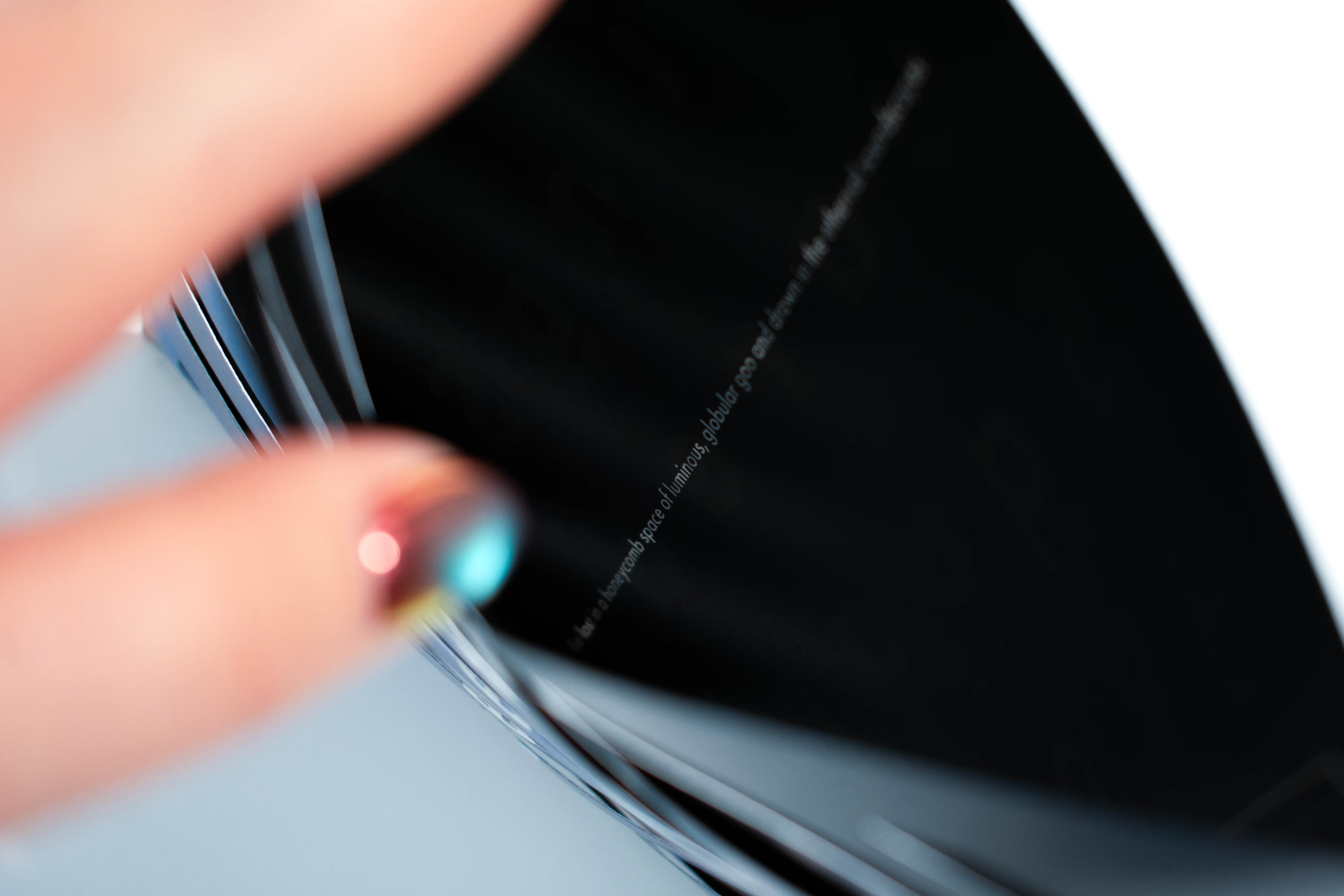

Visual references, stock photography, and mockups sourced from talented contributors on Unblast, , Death to Stock, and Pexels. Thank you to the photographers and artists behind these resources. Unless otherwise noted, photography and visual direction by :DLKA.