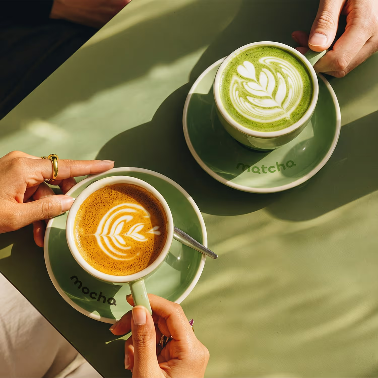
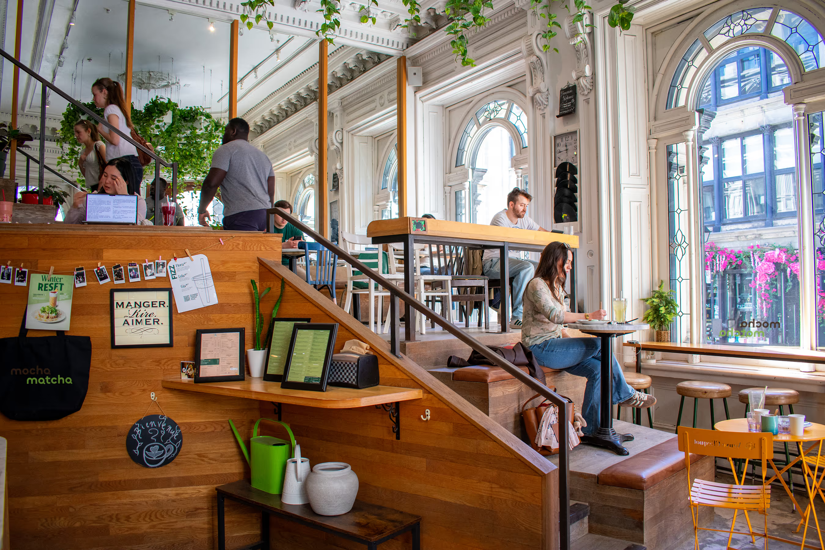
The mandate was to create a comprehensive visual identity for a new café concept that merges two worlds, coffee and matcha, into a cohesive brand. The challenge was to avoid clichés from either side and instead design something that feels calm yet energetic, minimal yet warm, and distinctive in a crowded café landscape.
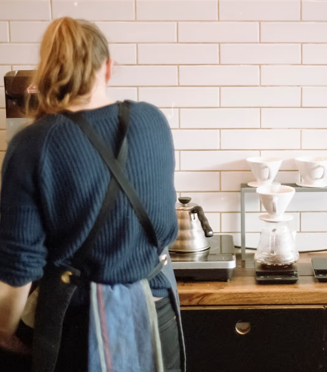

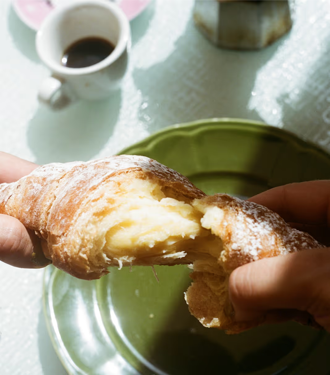
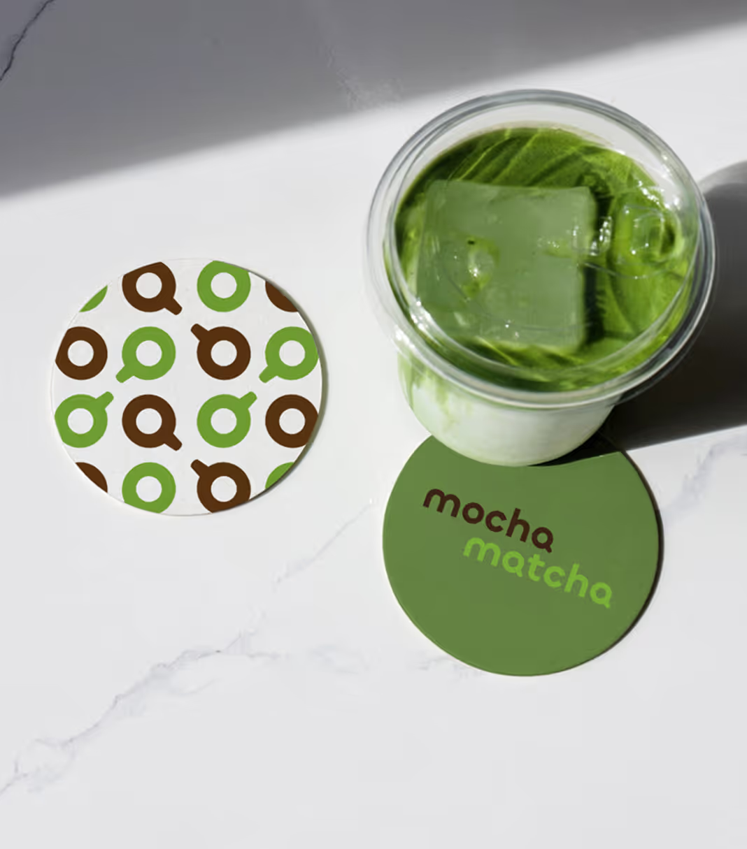
My vision was to capture the quiet balance between energy and calm, where bold coffee culture meets the softer ritual of matcha in a place people would want to linger in, not just pass through. The concept centers on contrast and harmony, shaping a brand personality that feels balanced, grounded, and quietly playful. From there, I explored how this tension could translate into a visual language for a modern café, looking at directions ranging from earthy and organic to more graphic and contemporary.
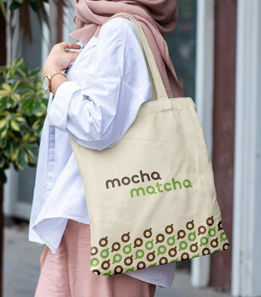
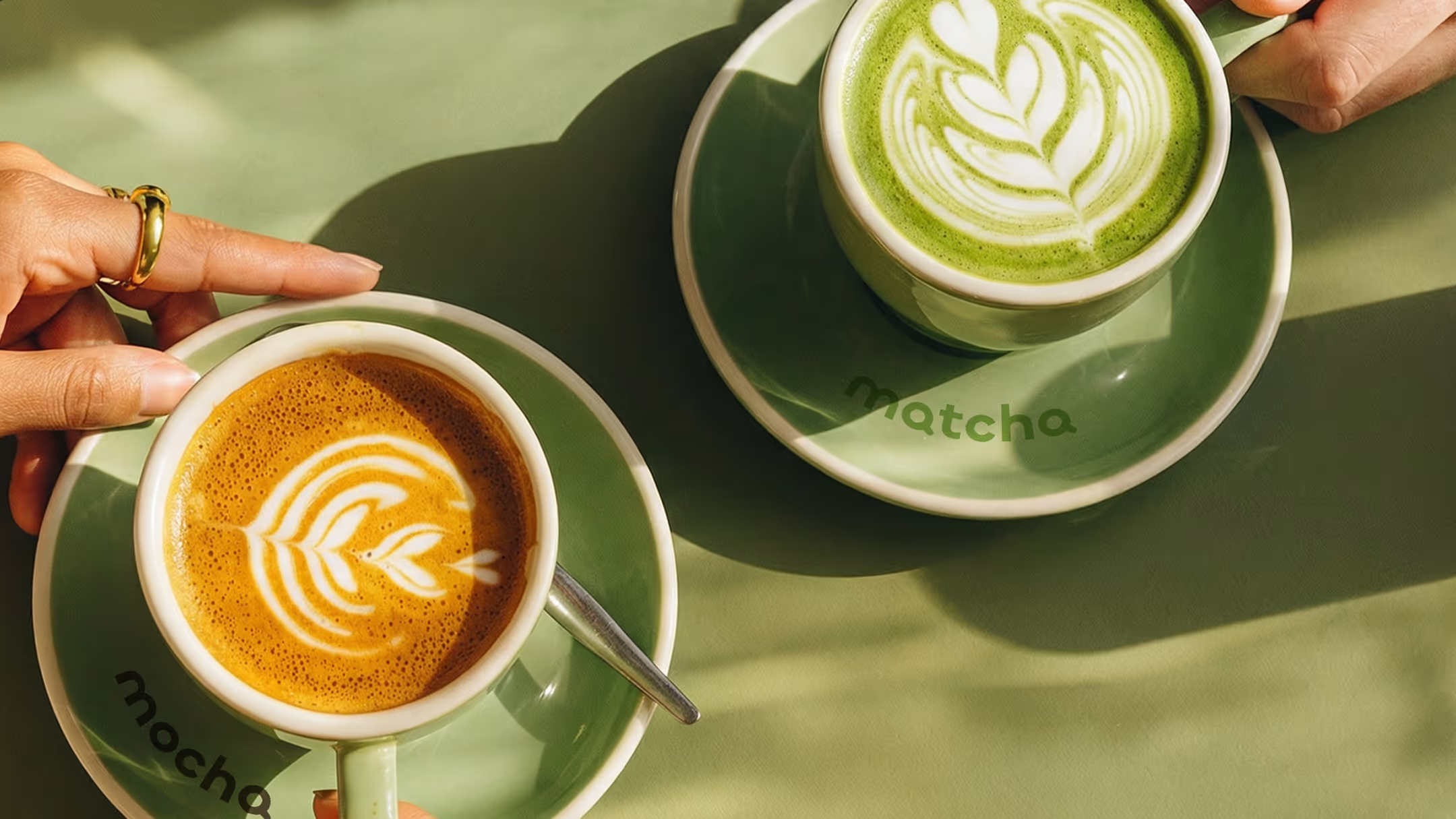
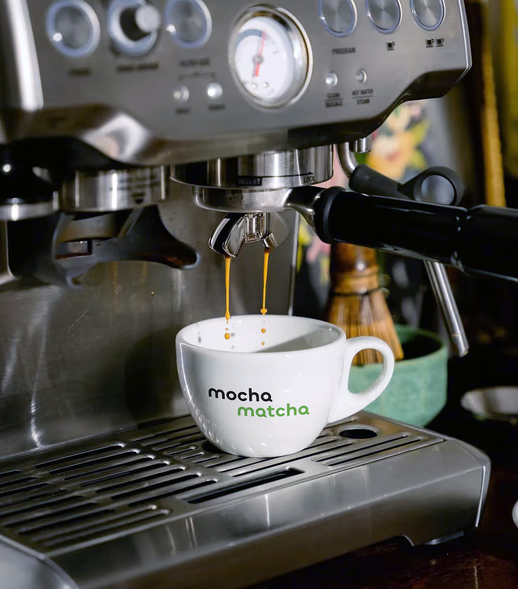
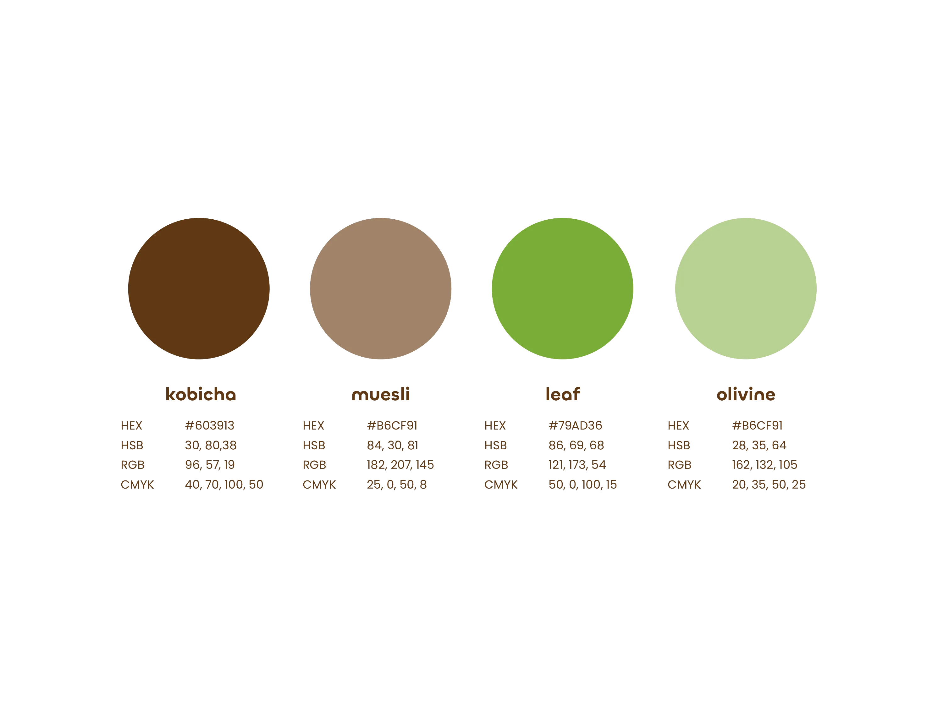
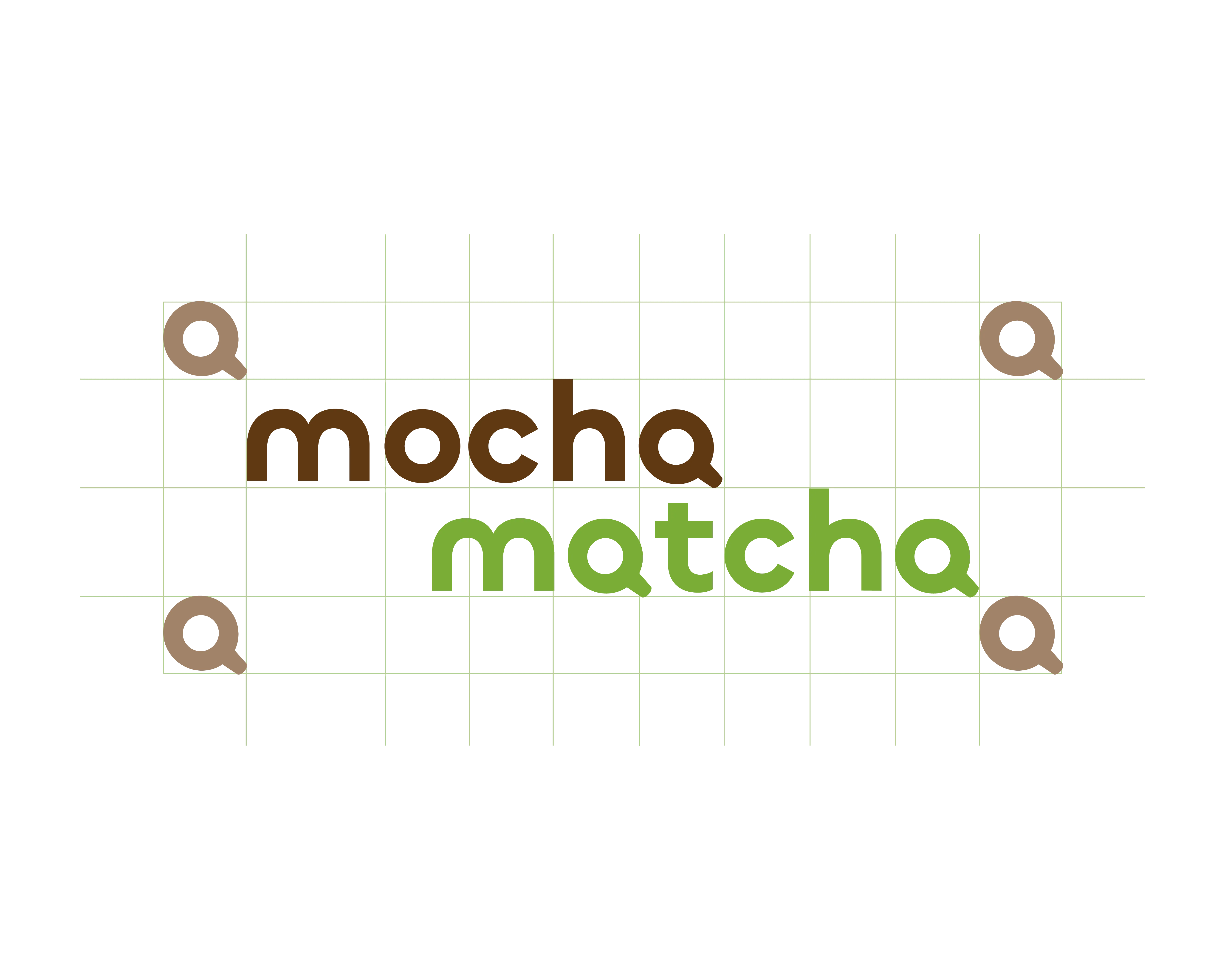
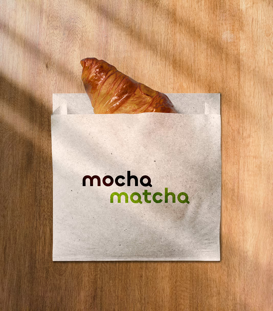
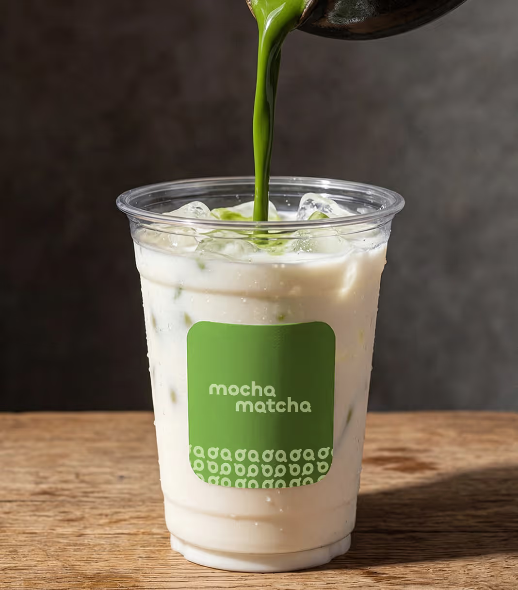
The brand identity expresses this balance through a palette of warm browns and soft greens, reflecting the pairing of the main ingredients. A clean, modular logotype paired with friendly, rounded typography creates clarity while maintaining warmth. Structured layouts and a simple grid system allow the identity to scale consistently across menus, packaging, signage, and digital applications. The result is a cohesive brand system that feels inviting, adaptable, and built for everyday interaction.

Visual references, stock photography, and mockups sourced from talented contributors on Mockup Maison, Unsplash, Death to Stock, and Stills. Thank you to the photographers and artists behind these resources. Unless otherwise noted, photography and visual direction by :DLKA.